
Bootstrap 4: Responsive Web Design Solution
0 16415
"The most eventual version bootstrap 4 of bootstrap has finally released out for responsive web design solutions".
Bootstrap has driven its standardization over past years specifically in web development. It permits developers to build responsive designs quickly with complete customization.
We can say bootstrap as a freely available front-end framework for web development. The basic-design templates of HTML, JS, and CSS are combined in it including forms, navigation, image carousels, and several other components.
 Let's dive in the most awaited version of Bootstrap i.e. Bootstrap 4, what's new in it, what's limitation has been removed in it and what advanced things one can easily do with it.
Flexbox
In bootstrap earlier versions, there needs to write long CSS code including floats, height, and width while Bootstrap 4 shortens CSS code.
A real-time use case of Bootstrap
Bootstrap is enabled to ensure the mobile responsiveness of any website as displayed in a screenshot. This example can be beneficial for understanding the concept of bootstrap for beginners. In the following figure: "A well-organized section with separated lists" has been created through bootstrap.
Let's dive in the most awaited version of Bootstrap i.e. Bootstrap 4, what's new in it, what's limitation has been removed in it and what advanced things one can easily do with it.Bootstrap 4
Bootstrap 4, the trending framework recommended for responsive applications and quick UI designing. It was developed by Mark Otto with great improvements and finally released in 2018. This version provides numerous pre-built components, mixins, a responsive grid system, utility classes, and outstanding print styles. Bootstrap 4 has been introduced with optimization measures and irrelevant element's removal. This version is not compatible with Ios 6, IE8 and IE9Why Bootstrap 4?
a) To dive into the entire features of Bootstrap, there is no need for in-depth knowledge of HTML and CSS. b) Bootstrap is compatible with entire modern browsers including Internet Explorer, Safari, Chrome, and Firefox. c) More Responsive features adapt to different screen sizes. d) Replace efforts of creating style sheets. e) No requirements of JS libraries as they contain in-built plugins and classes. f) To prevent replications. g) To prototype advanced designs. Let's go through major improvements found in Bootstrap4.Reboot Functionality
It was found in earlier versions of bootstrap, a dependency of normalize.css. This CSS is required for the entire HTML element's rendering. This dependency has been rubbed out in Bootstrap 4 by mixing its few portions with Bootstrap's reboot. For better normalization, the reboot is used in Bootstrap 4 to permit an elegant baseline styling and maintain the standardization of modern web requirements.Reboot.css?
Reboot.css is almost identical to normalize.css containing an outstanding "reset" feature. a) By default make use of box-size:border-box on entire elements. b) Nature base styling on each element. Some protocols need to be reminded while selecting what to override:- Browser's default values can be updated to "rems".
- In place of "ems" to permit accessible component spacing.
- Margin-top should be avoided.
- Rems for margins should be implemented for block elements for easier scaling.
- Detain font-related properties along with its declaration to a least via inherit.
Flexbox
"Everything is Flex-dependent"
The biggest improvement over bootstrap3 in Bootstrap4 is the use of flexbox which ensures flexibility. As this grid, ships numerous remarkable features to make bootstrap a wonderful framework. It replaced the requirement of floats /positioning for layout structure management. This module empowers with advanced components that permit flexible responsive layout designing. It includes auto margins, auto layout grid, vertical centering. Flexbox replaces the efforts of writing a bunch of code lines and permits anyone to maintain flexibility i.e. size adjustment features.- One can create grid columns of identical width and auto spacing as per requirement
- Auto margin can also be created through flexbox for easy spacing
- It allows Navigation as well as justified button groups creation
- Identical height and width cards
Let's understand through an example of flexbox:
In bootstrap earlier versions, there needs to write long CSS code including floats, height, and width while Bootstrap 4 shortens CSS code.
Program:
<!DOCTYPE html>
<html lang="en">
<head>
  <title>Bootstrap Example</title>
  <meta charset="utf-8">
  <meta name="viewport" content="width=device-width, initial-scale=1">
  <link rel="stylesheet" href="https://maxcdn.bootstrapcdn.com/bootstrap/4.3.1/css/bootstrap.min.css">
  <script src="https://maxcdn.bootstrapcdn.com/bootstrap/4.3.1/js/bootstrap.min.js"></script>
  <style>
  .p-2{border:1px solid#000;}
  </style>
</head>
<body>
<div class="container mt-3">
  <h2>Horizontal Direction</h2>
  <p>Flex container is used for items to visualise side by side</p>
  <div class="d-flex flex-row bg-secondary mb-3">
    <div class="p-2 bg-info">Box 1
	<p>bootstap4 is advanced version of Bootstrap</p>
	</div>
    <div class="p-2 bg-warning">Box 2
	<p>HTML5 is an advanced framework of HTML</p></div>
    <div class="p-2 bg-primary">Box 3
	<p>html,css and JS are basic scripting language</p>
	</div>
	<div class="p-2 bg-primary">Box 4
	<p>bootstrap contains in-built plugins and class.</p></div>
	<div class="p-2 bg-primary">Box 5
	<p>Grid has been improved in Bootstap 4</p></div>
  </div>
</body>
</html>
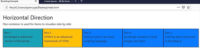
The above-mentioned bootstrap code used to create 5 different boxes i.e. Box1, Box2, Box3, Box4 and Box5 along with paragraphs through flexbox.
Output:
BOOTSTRAP 4 IMPROVED GRID SYSTEM:
New semantic mixins, pre-defined classes, and 5 tiers have been introduced in the Bootstrap4 Grid system i.e. xs, xl, sm, lg and md. This enhancement outspread the range of media queries to 544 px and prevent its replication. One can able to perform class alignment across vertical and horizontal. This can be easily demonstrated through one live example of a medium Grid system. Program:<!DOCTYPE html>
<html lang="en">
<head>
<title>Bootstrap Example</title>
<meta charset="utf-8">
<meta name="viewport" content="width=device-width, initial-scale=1">
<link rel="stylesheet" href="https://maxcdn.bootstrapcdn.com/bootstrap/4.3.1/css/bootstrap.min.css">
<script src="https://ajax.googleapis.com/ajax/libs/jquery/3.4.1/jquery.min.js"></script>
<script src="https://cdnjs.cloudflare.com/ajax/libs/popper.js/1.14.7/umd/popper.min.js"></script>
<script src="https://maxcdn.bootstrapcdn.com/bootstrap/4.3.1/js/bootstrap.min.js"></script>
</head>
<body>
<div class="container-fluid">
<h1>Medium Grid</h1>
<p>The following example will demonstrate result 25%/25%/25%/25% split on medium devices.</p>
<div class="container-fluid">
<div class="row">
<div class="col-md-3 bg-success">
Lorem ipsum dolor sit amet, consectetur adipisicing elit, sed do eiusmod tempor incididunt ut labore et dolore magna aliqua.<br>
Ut enim ad minim veniam, quis nostrud exercitation ullamco laboris nisi ut aliquip ex ea commodo consequat.
</div>
<div class="col-md-3 bg-warning">
Sed ut perspiciatis unde omnis iste natus error sit voluptatem accusantium doloremque laudantium, totam rem
aperiam, eaque ipsa quae ab illo inventore veritatis et quasi architecto beatae vitae dicta sunt explicabo.
</div>
<div class="col-md-3 bg-success">
Lorem ipsum dolor sit amet, consectetur adipisicing elit, sed do eiusmod tempor incididunt ut labore et dolore magna aliqua.<br>
Ut enim ad minim veniam, quis nostrud exercitation ullamco laboris nisi ut aliquip ex ea commodo consequat.
</div>
</body>
</html>
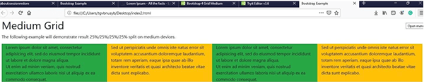
This program includes Medium Grid col-md-3 for 25%/25%/25%/25% partition on medium device horizontally.
Output:
Responsive Spacing Utilities
Bootstrap 4 provides a comprehensive list of responsive Utilities and margin classes for appearance modification. This includes text modification's shortcuts, responsive embedding, floats, and text alignment classes
How does this work?
There is a need to assign certain padding values to their respective elements with shorthand classes. Embraces support of entire properties including individual, vertical and horizontal. These classes are constructed from a Sass map whose range is .25rem. Example: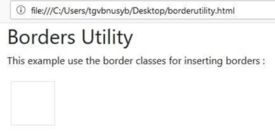
There is a need to assign certain padding values to their respective elements with shorthand classes. Embraces support of entire properties including individual, vertical and horizontal. These classes are constructed from a Sass map whose range is .25rem. Example:
<!DOCTYPE html>
<html lang="en">
<head>
  <title>Bootstrap4 Example of border utility</title>
  <meta charset="utf-8">
  <meta name="viewport" content="width=device-width, initial-scale=1">
  <link rel="stylesheet" href="https://maxcdn.bootstrapcdn.com/bootstrap/4.3.1/css/bootstrap.min.css">

  <script src="https://maxcdn.bootstrapcdn.com/bootstrap/4.3.1/js/bootstrap.min.js"></script>
  <style>
  .border {
    display: inline-block;
    width: 70px;
    height: 70px;
    margin: 6px;
  }
  </style>
</head>
<body>
<div class="container">
  <h2>Borders Utility</h2>
  <p>This example use the border classes for inserting borders :</p>
  <span class="border"></span>
</div>
</body>
</html>
Output:
SASS Performance
In Bootstrap 4, SASS is used instead of LESS for CSS file preprocessing. SASS is relatively compatible with every CSS version. This results in a quick compilation. GLOBAL changes that let a designer switch bootstrap 4 instead of traditional versions: a) The border-box value has been set to content-box in Bootstrap 4. b) The new card components have been introduced in Bootstrap to extent content containers with various options like footers, appearance options, and background colors. c) Bootstrap 4 permits more responsiveness. d) The compilation occurs fast as a comparison to earlier versions. e) Easy-to-use layouts. f) Bootstrap 4 permits UI components to create large space for flexibility and for creative implementations. g) Bootstrap 4 provides REMs and Ems for responsive typography implementation instead of pixels.
In Bootstrap 4, SASS is used instead of LESS for CSS file preprocessing. SASS is relatively compatible with every CSS version. This results in a quick compilation. GLOBAL changes that let a designer switch bootstrap 4 instead of traditional versions: a) The border-box value has been set to content-box in Bootstrap 4. b) The new card components have been introduced in Bootstrap to extent content containers with various options like footers, appearance options, and background colors. c) Bootstrap 4 permits more responsiveness. d) The compilation occurs fast as a comparison to earlier versions. e) Easy-to-use layouts. f) Bootstrap 4 permits UI components to create large space for flexibility and for creative implementations. g) Bootstrap 4 provides REMs and Ems for responsive typography implementation instead of pixels.
Conclusion:
Bootstrap4 includes many more improvements apart from this article in terms of styles, layouts, etc. This post covers some major improvements. For entire modification and to learn bootstrap online, you can refer to Bootstrap's official website's documentation to improve the user experience of designing responsive mobile applications.
Bootstrap4 includes many more improvements apart from this article in terms of styles, layouts, etc. This post covers some major improvements. For entire modification and to learn bootstrap online, you can refer to Bootstrap's official website's documentation to improve the user experience of designing responsive mobile applications.

Share:


Comments
Waiting for your comments