
Bootstrap 4 Modal
0 5536
A Modal is a dialog box/popup window that can be used to provide important information to the user or prompt the user to take necessary actions before moving on. We can apply for lightboxes, user notifications, UI enhancements, e-commerce components, and many other things.
You can easily create very smart and flexible dialog boxes with the Bootstrap modal plugin because It's easily customizable. You can manipulate its size, position, and content. It is displayed on top of the current page.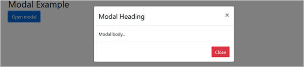 Let's talks about its class:
We are used class="modal", class="modal-dialog", class="modal-content", class="modal-header"
class="modal-title", class="modal-body", class="modal-footer" to build a popup for bootstrap.
1) .model - it defines the model.
2). .modal-dialog - it is used to change the size of the modal by adding the .modal-sm class for small modals, .modal-lg class for large modals, or .modal-xl for extra-large modals.
Used for extra-large modals
Let's talks about its class:
We are used class="modal", class="modal-dialog", class="modal-content", class="modal-header"
class="modal-title", class="modal-body", class="modal-footer" to build a popup for bootstrap.
1) .model - it defines the model.
2). .modal-dialog - it is used to change the size of the modal by adding the .modal-sm class for small modals, .modal-lg class for large modals, or .modal-xl for extra-large modals.
Used for extra-large modals
How to create a Modal:
<!DOCTYPE html>
<html lang="en">
<head>
<title>Bootstrap Modal Example</title>
<meta charset="utf-8">
<meta name="viewport" content="width=device-width, initial-scale=1">
<link rel="stylesheet" href="https://maxcdn.bootstrapcdn.com/bootstrap/4.4.1/css/bootstrap.min.css">
<script src="https://ajax.googleapis.com/ajax/libs/jquery/3.4.1/jquery.min.js"></script>
<script src="https://cdnjs.cloudflare.com/ajax/libs/popper.js/1.16.0/umd/popper.min.js"></script>
<script src="https://maxcdn.bootstrapcdn.com/bootstrap/4.4.1/js/bootstrap.min.js"></script>
</head>
<body>
<div class="container">
<h2>Modal Example</h2>
<!-- Button to Open the Modal -->
<button type="button" class="btn btn-primary" data-toggle="modal" data-target="#myModal">
Open modal
</button>
<!-- The Modal -->
<div class="modal" id="myModal">
<div class="modal-dialog">
<div class="modal-content">
<!-- Modal Header -->
<div class="modal-header">
<h4 class="modal-title">Modal Heading</h4>
<button type="button" class="close" data-dismiss="modal">×</button>
</div>
<!-- Modal body -->
<div class="modal-body">
Modal body..
</div>
<!-- Modal footer -->
<div class="modal-footer">
<button type="button" class="btn btn-danger" data-dismiss="modal">Close</button>
</div>
</div>
</div>
</div>
</div>
</body>
</html>
Output:
You try out the above example. It will launch the modal window automatically when the DOM is fully loaded via JavaScript.
Let's talks about its class:
We are used class="modal", class="modal-dialog", class="modal-content", class="modal-header"
class="modal-title", class="modal-body", class="modal-footer" to build a popup for bootstrap.
1) .model - it defines the model.
2). .modal-dialog - it is used to change the size of the modal by adding the .modal-sm class for small modals, .modal-lg class for large modals, or .modal-xl for extra-large modals.
Used for extra-large modals<div class="modal-dialog modal-xl">Used for small modals
<div class="modal-dialog modal-sm">Used for large modals
<div class="modal-dialog modal-lg">Enter the modal vertically and horizontally within the page
<div class="modal-dialog modal-dialog-centered">It used only scroll inside the modal
<div class="modal-dialog modal-dialog-scrollable">3) .modal-content - it tells about here model content is written. 4) .modal-header - this is defined model header section. 5) .modal-title - its define model heading title. 6) .modal-body - its defined body part of the model. You can write the main content here. 7) .modal-footer - it optional, it defines model footer. If you want to close the model box through button then you add this section. Note:
By default, modals are "medium" in size.

Share:


Comments
Waiting for your comments