
Bootstrap 4 Alerts
0 4449
Bootstrap 4 provides to create predefined messages that called Alert Message. Alert boxes are used to the information that requires the immediate attention of the user's end, such as warning, error, or confirmation messages.
With the help of Bootstrap, you can easily create a predefined alert message box for various purposes. You can also add an optional close button to dismiss any alert box.
Alerts box are created with the alert class, such as .alert-success, .alert-info, .alert-warning, .alert-danger, .alert-primary, .alert-secondary, .alert-light or .alert-dark.
Program: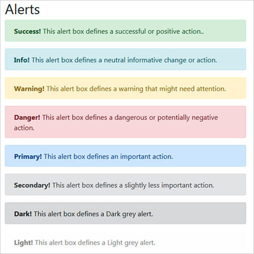
Let's talks about its class:
Note: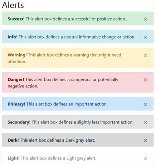
<!DOCTYPE html>
<html lang="en">
<head>
 <title>Bootstrap Alerts Example</title>
 <meta charset="utf-8">
 <meta name="viewport" content="width=device-width, initial-scale=1">
 <link rel="stylesheet" href="https://maxcdn.bootstrapcdn.com/bootstrap/4.4.1/css/bootstrap.min.css">
 <script src="https://ajax.googleapis.com/ajax/libs/jquery/3.4.1/jquery.min.js"></script>
 <script src="https://cdnjs.cloudflare.com/ajax/libs/popper.js/1.16.0/umd/popper.min.js"></script>
 <script src="https://maxcdn.bootstrapcdn.com/bootstrap/4.4.1/js/bootstrap.min.js"></script>
</head>
<body>

<div class="container">
 <h2>Alerts</h2>
 <div class="w-50">
 <div class="alert alert-success">
  <strong>Success!</strong> This alert box defines a successful or positive action..
 </div>
 <div class="alert alert-info">
  <strong>Info!</strong> This alert box defines a neutral informative change or action.
 </div>
 <div class="alert alert-warning">
  <strong>Warning!</strong> This alert box defines a warning that might need attention.
 </div>
 <div class="alert alert-danger">
  <strong>Danger!</strong> This alert box defines a dangerous or potentially negative action.
 </div>
 <div class="alert alert-primary">
  <strong>Primary!</strong> This alert box defines an important action.
 </div>
 <div class="alert alert-secondary">
  <strong>Secondary!</strong> This alert box defines. a slightly less important action.
 </div>
 <div class="alert alert-dark">
  <strong>Dark!</strong> This alert box defines a Dark grey alert.
 </div>
 <div class="alert alert-light">
  <strong>Light!</strong> This alert box defines a Light grey alert.
 </div>
</div>
</div>

</body>
</html>
Output:
Let's talks about its class:
- .alert-success: This alert box defines a successful or positive action.
- .alert-info: This alert box defines a neutral informative change or action.
- .alert-warning: This alert box defines a warning that might need attention.
- .alert-danger: This alert box defines a dangerous or potentially negative action.
- .alert-primary: This alert box defines an important action.
- .alert-secondary: This alert box defines a slightly less important action.
- .alert-dark: This alert box defines a Dark grey alert.
- .alert-light: This alert box defines a Light grey alert.
Note:
- The .fade and .show classes on the .alert element that used to enable the fading transition effect while closing the alert boxes. If you do not want animation just removes these classes.
- The class .alert-dismissible is required to close the alert message. When you click on this the alert box will disappear. If your alert doesn't have a close button you can skip this class.
- × (x) is an HTML entity that is the preferred icon for close buttons, rather than the letter "x".
<!DOCTYPE html>
<html lang="en">
<head>
<title>Bootstrap Alerts Example</title>
<meta charset="utf-8">
<meta name="viewport" content="width=device-width, initial-scale=1">
<link rel="stylesheet" href="https://maxcdn.bootstrapcdn.com/bootstrap/4.4.1/css/bootstrap.min.css">
<script src="https://ajax.googleapis.com/ajax/libs/jquery/3.4.1/jquery.min.js"></script>
<script src="https://cdnjs.cloudflare.com/ajax/libs/popper.js/1.16.0/umd/popper.min.js"></script>
<script src="https://maxcdn.bootstrapcdn.com/bootstrap/4.4.1/js/bootstrap.min.js"></script>
</head>
<body>
<div class="container">
<h2>Alerts</h2>
<div class="w-50">
<div class="alert alert-success alert-dismissible fade show">
<button type="button" class="close" data-dismiss="alert">×</button>
<strong>Success!</strong> This alert box defines a successful or positive action..
</div>
<div class="alert alert-info alert-dismissible fade show">
<button type="button" class="close" data-dismiss="alert">×</button>
<strong>Info!</strong> This alert box defines a neutral informative change or action.
</div>
<div class="alert alert-warning alert-dismissible fade show">
<button type="button" class="close" data-dismiss="alert">×</button>
<strong>Warning!</strong> This alert box defines a warning that might need attention.
</div>
<div class="alert alert-danger alert-dismissible fade show">
<button type="button" class="close" data-dismiss="alert">×</button>
<strong>Danger!</strong> This alert box defines a dangerous or potentially negative action.
</div>
<div class="alert alert-primary alert-dismissible fade show">
<button type="button" class="close" data-dismiss="alert">×</button>
<strong>Primary!</strong> This alert box defines an important action.
</div>
<div class="alert alert-secondary alert-dismissible fade show">
<button type="button" class="close" data-dismiss="alert">×</button>
<strong>Secondary!</strong> This alert box defines a slightly less important action.
</div>
<div class="alert alert-dark alert-dismissible fade show">
<button type="button" class="close" data-dismiss="alert">×</button>
<strong>Dark!</strong> This alert box defines a Dark grey alert.
</div>
<div class="alert alert-light alert-dismissible fade show">
<button type="button" class="close" data-dismiss="alert">×</button>
<strong>Light!</strong> This alert box defines a Light grey alert.
</div>
</div>
</div>
</body>
</html>
Output:

Share:


Comments
Waiting for your comments