
CSS and Importance of IFrame in CSS
3 5274
Now dragging a little attention towards the basic concept of CSS. This language was initially developed by Hakon Wium Lie. CSS is a particular language that holds its own syntax and is responsible for enhancing the styling capability of the WebPages according to one's requirement. The role of CSS is to embed design and style to a webpage. You can also find various online CSS tutorial to help you understand more about other elements of CSS.
Establishment of CSS By the end of the year 1996, CSS was all set to become official and on 17th December 1996, its primary version CSS Level 1 was introduced. Every version of this language was getting enhanced from the prior one by boosting up more features and they were named as CSS Level 1, CSS Level 2, CSS Level 3, and CSS Level 4. Moving further, all mentioned above CSS versions were introduced in different years. The first version was identified in 1996, Level 2 took place in the year 1998, level 3 came in 1999 and the latest is level 4.
Why Iframe is essential for a responsive Webpage? It can be noticed that in the present scenario, the majority of the population prefers mobile phones to surf the internet. As an impact of this, it is very essential for the WebPages to be responsive. The majority of the webPages are embedding some external elements of the websites such as YouTube Videos, Google maps and so on.
Use case 01:
One clear example of this is the Ola Cabs. You must be very familiar with this famous car rental app, Right? Fine, let me explain to you how Iframe works here. Whenever you will open this application, you will find several icons such as Google Play, App Store and Microsoft embedded in Iframe. When you will click on the Play Store iframe, it will take you to the play store page, where you can download the application.
Use Case 02:
Apart from this, you will also find the Google map while booking your ride from Ola. You can locate your destination in no time and also you can go with the directions given on the Google map. When you enter your destination and pickup location, you will see a Google map iframe embedded on the Ola page which is used to display the destination you chose. These all are done with the CSS inline frame.
IFrame and How to Create a Responsive IFrame Before moving forward towards discussing the ways to make a responsive IFrame, we would know what is meant by an Iframe (Inline Frame). Well, in easy words, it can be defined as an HTML document that is inserted into another document. Trust me, lads, it is one of the trickiest things to make your webpage responsive! Distant from traditional frames, which were responsible for a webpage structure, IFrames can be embedded easily in a webpage layout. Mainly, IFrame is used for multimedia and online advertisement. An example is mentioned below on how an IFrame can be embedded into an HTML Document using the IFrame tag: Voila! You have created your first IFrame on your webpage.
In the above code, we have used the CSS IFrame attribute which will insert a URL to Coding Tag within the page.
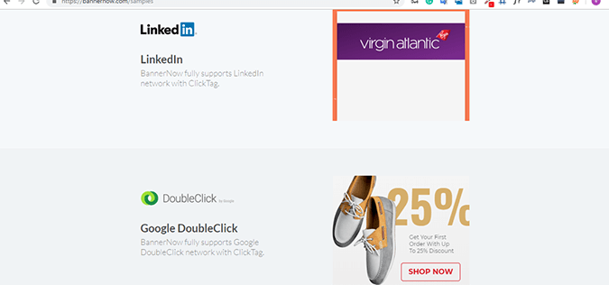
IFrame provides more flexibility as compared to the inline script, and many ad platforms use this function to exhibit ads on WebPages.
For instance, when you open the Banner Now website, you will find several ads displayed on the page within frames.
To ensure the reporting accuracy for publishers and advertisers, the advertisers may insert more than one tracking code in an IFrame. It can be considered as an important practice because in some cases, IFrame can even contain an entire webpage which can provide more usefulness to the webpage.
Voila! You have created your first IFrame on your webpage.
In the above code, we have used the CSS IFrame attribute which will insert a URL to Coding Tag within the page.
IFrame provides more flexibility as compared to the inline script, and many ad platforms use this function to exhibit ads on WebPages.
For instance, when you open the Banner Now website, you will find several ads displayed on the page within frames.
To ensure the reporting accuracy for publishers and advertisers, the advertisers may insert more than one tracking code in an IFrame. It can be considered as an important practice because in some cases, IFrame can even contain an entire webpage which can provide more usefulness to the webpage.
 Now, what is a responsive iframe?
A responsive iframe refers to the frame embedded within the webpage which adjusts to display its content when the window is resized. Note that the iframe can be responsive as per the display and the screen size but the content within the frame will have its own height and width.
Now, what is a responsive iframe?
A responsive iframe refers to the frame embedded within the webpage which adjusts to display its content when the window is resized. Note that the iframe can be responsive as per the display and the screen size but the content within the frame will have its own height and width.
Steps to make an Iframe Responsive Let us overview several steps which can be used to make an IFrame responsive: a) Firstly, paste the IFrame embedded code into your HTML document. b) Secondly, fix the width and height attributes inside the code to 100% which is done using CSS and is an optional step. c) Thirdly, place the IFrame inside the case and position it accordingly. The CSS position of the IFrame tag will be set to absolute and the top and left parameter will be set to 0. d) Lastly, add padding-bottom to the container. Here is an example for you to show how to inset a responsive YouTube IFrame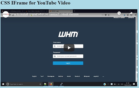 After running the code, the following page will be displayed with the YouTube video embedded as an iframe.
Common Error while embedding the YouTube videos through <iframe> tag:
Note that when we try to embed the YouTube video in the webpage as an IFrame element via general syntax, we will exhibit an error as the YouTube doesn't allow its videos to be embedded.
After running the code, the following page will be displayed with the YouTube video embedded as an iframe.
Common Error while embedding the YouTube videos through <iframe> tag:
Note that when we try to embed the YouTube video in the webpage as an IFrame element via general syntax, we will exhibit an error as the YouTube doesn't allow its videos to be embedded.
 Therefore, in order to avoid this error, it is advisable to copy the embed code by right clicking on the YouTube video, which will resolve the issue.
That's all!! Wasn't it easy??
Therefore, in order to avoid this error, it is advisable to copy the embed code by right clicking on the YouTube video, which will resolve the issue.
That's all!! Wasn't it easy??
Conclusion:
Here is a short summary for you to go through. In this article, we have gone through the importance of responsive IFrame in CSS along with several examples. Besides, one example has been done for you to make things clear as to how the IFrames are used in a webpage. So, I hope I have saved your time by compiling these things in this article and I wish it cleared your doubts on CSS IFrames. To know more about job-related questions, you can search for CSS Interview questions which will help you to gain more insight in context to the CSS Iframes.
Establishment of CSS By the end of the year 1996, CSS was all set to become official and on 17th December 1996, its primary version CSS Level 1 was introduced. Every version of this language was getting enhanced from the prior one by boosting up more features and they were named as CSS Level 1, CSS Level 2, CSS Level 3, and CSS Level 4. Moving further, all mentioned above CSS versions were introduced in different years. The first version was identified in 1996, Level 2 took place in the year 1998, level 3 came in 1999 and the latest is level 4.
Why Iframe is essential for a responsive Webpage? It can be noticed that in the present scenario, the majority of the population prefers mobile phones to surf the internet. As an impact of this, it is very essential for the WebPages to be responsive. The majority of the webPages are embedding some external elements of the websites such as YouTube Videos, Google maps and so on.
Use case 01:
One clear example of this is the Ola Cabs. You must be very familiar with this famous car rental app, Right? Fine, let me explain to you how Iframe works here. Whenever you will open this application, you will find several icons such as Google Play, App Store and Microsoft embedded in Iframe. When you will click on the Play Store iframe, it will take you to the play store page, where you can download the application.
Use Case 02:
Apart from this, you will also find the Google map while booking your ride from Ola. You can locate your destination in no time and also you can go with the directions given on the Google map. When you enter your destination and pickup location, you will see a Google map iframe embedded on the Ola page which is used to display the destination you chose. These all are done with the CSS inline frame.
IFrame and How to Create a Responsive IFrame Before moving forward towards discussing the ways to make a responsive IFrame, we would know what is meant by an Iframe (Inline Frame). Well, in easy words, it can be defined as an HTML document that is inserted into another document. Trust me, lads, it is one of the trickiest things to make your webpage responsive! Distant from traditional frames, which were responsible for a webpage structure, IFrames can be embedded easily in a webpage layout. Mainly, IFrame is used for multimedia and online advertisement. An example is mentioned below on how an IFrame can be embedded into an HTML Document using the IFrame tag:
<!DOCTYPE html>
<html>
<body>
<iframe src="https://www.codingtag.com/">
/* here the inline iframe is used which contains the link to the html document to be embedded */
<p>This is an example of IFrame.</p>
</iframe>
</body>
</html>
Let us now run the above code and see how it works!
Voila! You have created your first IFrame on your webpage.
In the above code, we have used the CSS IFrame attribute which will insert a URL to Coding Tag within the page.
IFrame provides more flexibility as compared to the inline script, and many ad platforms use this function to exhibit ads on WebPages.
For instance, when you open the Banner Now website, you will find several ads displayed on the page within frames.
To ensure the reporting accuracy for publishers and advertisers, the advertisers may insert more than one tracking code in an IFrame. It can be considered as an important practice because in some cases, IFrame can even contain an entire webpage which can provide more usefulness to the webpage.
Now, what is a responsive iframe?
A responsive iframe refers to the frame embedded within the webpage which adjusts to display its content when the window is resized. Note that the iframe can be responsive as per the display and the screen size but the content within the frame will have its own height and width.Steps to make an Iframe Responsive Let us overview several steps which can be used to make an IFrame responsive: a) Firstly, paste the IFrame embedded code into your HTML document. b) Secondly, fix the width and height attributes inside the code to 100% which is done using CSS and is an optional step. c) Thirdly, place the IFrame inside the case and position it accordingly. The CSS position of the IFrame tag will be set to absolute and the top and left parameter will be set to 0. d) Lastly, add padding-bottom to the container. Here is an example for you to show how to inset a responsive YouTube IFrame
<!DOCTYPE html>
<html lang="en">
<meta name="viewport" content="width=device-width, initial-scale=1.0">
/* viewport display set for the webpage */
<head>
<style type= "text/CSS">
body {
  background-color: lightblue; /* background of the webpage will be set to lightblue */
}
.isresponsive { /* isresponsive class created */
width: 100%;
height: 0;
padding-bottom: 56.25; /* the padding between the content and the frame will be set */
position: relative; /* the position of the iframe will be set to relative */
}
.isresponsive iframe {
position: absolute;
width: 100%;
height: 100px;
}
</style>
</head>
<body>
<h1> CSS IFrame for YouTube Video </h1>
<div class= "responsive">
<iframe width="853" height="480" src="https://www.youtube.com/embed/TjHJot6D6ds" frameborder="0"
allow="accelerometer; autoplay; encrypted-media; gyroscope; picture-in-picture" allowfullscreen></iframe>
/* the height & width of the iframe along with the source URL will be set with embed code of YouTube video */
</div>
</body>
</html>
In this code, we have created a class with the name isresponsive for creating a responsive iframe. For this, the CSS code is embedded into the HTML document using internal CSS. CSS has been further used to define the position and styling of the iframe which defines the position, height, width and padding for the iframe within the isresponsive class.
In the further code, the div tag has been used which specifies the source of the URL which will be included in the iframe. Note that the embed code from the YouTube video has been integrated into the <iframe> tag.
After running the code, the following page will be displayed with the YouTube video embedded as an iframe.
Common Error while embedding the YouTube videos through <iframe> tag:
Note that when we try to embed the YouTube video in the webpage as an IFrame element via general syntax, we will exhibit an error as the YouTube doesn't allow its videos to be embedded.
Therefore, in order to avoid this error, it is advisable to copy the embed code by right clicking on the YouTube video, which will resolve the issue.
That's all!! Wasn't it easy??Conclusion:
Here is a short summary for you to go through. In this article, we have gone through the importance of responsive IFrame in CSS along with several examples. Besides, one example has been done for you to make things clear as to how the IFrames are used in a webpage. So, I hope I have saved your time by compiling these things in this article and I wish it cleared your doubts on CSS IFrames. To know more about job-related questions, you can search for CSS Interview questions which will help you to gain more insight in context to the CSS Iframes.

Share:


Shivam Aug 25, 2019
I was really confused about iframe, i am involved in a project, iframe is by the backend team, but i still wanna know it, but seriously this made my day. Thanq Is it possible to email me more such articles on Iframe or on plugins? In a simple language, just like this one ?