
CSS3 Filter
0 4361
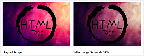
1. CSS3 Filter Grayscale(): You can increase and decrease the percentage of grayscale of CSS3 Filter.
Easily modify filter, float, margin, size increase decrease of width and height.
Example:
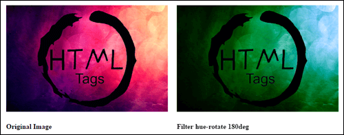
2. CSS3 Filter Hue-Rotate - Intersting filter, change the color effect of image through CSS3 Filter Hue-Rotate
Example:
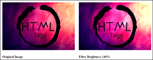
3. CSS3 Filter Brightness - Easily change the brightness with the help of CSS3 Filters.
Example:
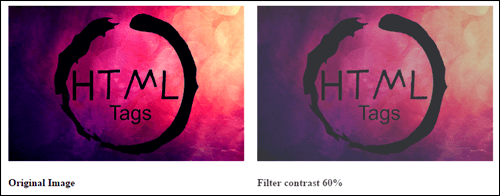
4) CSS3 Filter Contrast - Easily change the contrast of Image with the help of CSS3 Filters.
Example:
5) CSS3 Filter Sepia:
Example:
6) CSS3 Filter Saturate:
Example:
7) CSS3 Filter Invert:
Example:
8) CSS3 Filter Drop-Shadow:
Example:
Example:
<!DOCTYPE html>Result:
<html>
<head>
<style type="text/css">
.filter-grayscale{
-webkit-filter: grayscale(50%);
filter: grayscale(50%);
float:left;
margin:10px;
}
.container{ float:left; margin:10px;}
</style>
</head>
<body>
<div class="container">
<img src="IMAGE PATH" >
<h4> Original Image </h4>
</div>
<div class="filter-grayscale">
<img src="IMAGE PATH" >
<h4> Filter Image Grayscale 50% </h4>
</div>
</body>
</html>
2. CSS3 Filter Hue-Rotate - Intersting filter, change the color effect of image through CSS3 Filter Hue-Rotate
Example:
<!DOCTYPE html>Result:
<html>
<head>
<style type="text/css">
.container{
float:left;
margin:10px;
}
.hue-rotate{
filter: hue-rotate(180deg);
-webkit-filter: hue-rotate(180deg);
float:left;
margin:10px;
}
</style>
</head>
<body>
<div class="container">
<img src="IMAGE PATH" >
<h4> Original Image </h4>
</div>
<div class="hue-rotate">
<img src="IMAGE PATH" >
<h4> Filter hue-rotate 180deg </h4>
</div>
</body>
</html>
3. CSS3 Filter Brightness - Easily change the brightness with the help of CSS3 Filters.
Example:
<!DOCTYPE html>Result:
<html>
<head>
<style type="text/css">
.container{
float:left;
margin:10px;
}
.brightness{
filter: brightness(140%);
-webkit-filter: brightness(140%);
float:left;
margin:10px;
}
</style>
</head>
<body>
<div class="container">
<img src="IMAGE PATH" >
<h4> Original Image </h4>
</div>
<div class="brightness">
<img src="IMAGE PATH" >
<h4> Filter Brightness 140% </h4>
</div>
</body>
</html>
4) CSS3 Filter Contrast - Easily change the contrast of Image with the help of CSS3 Filters.
Example:
<!DOCTYPE html>Result:
<html>
<head>
<style type="text/css">
.container{
float:left;
margin:10px;
}
.contrast{
filter: contrast(60%);
-webkit-filter: contrast(60%);
float:left;
margin:10px;
}
</style>
</head>
<body>
<div class="container">
<img src="IMAGE PATH" >
<h4> Original Image </h4>
</div>
<div class="contrast">
<img src="IMAGE PATH" >
<h4> Filter contrast 60% </h4>
</div>
</body>
</html>
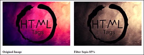
5) CSS3 Filter Sepia:
Example:
<!DOCTYPE html>Result:
<html>
<head>
<style type="text/css">
.container{
float:left;
margin:10px;
}
.sepia{
filter: sepia(85%);
-webkit-filter: sepia(85%);
float:left;
margin:10px;
}
</style>
</head>
<body>
<div class="container">
<img src="IMAGE PATH" >
<h4> Original Image </h4>
</div>
<div class="sepia">
<img src="IMAGE PATH" >
<h4> Filter sepia 85% </h4>
</div>
</body>
</html>
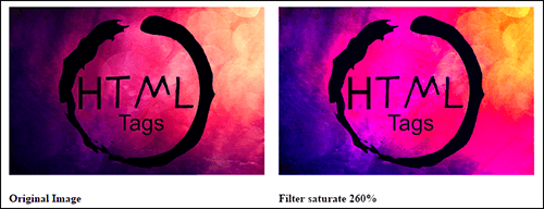
6) CSS3 Filter Saturate:
Example:
<!DOCTYPE html>Result:
<html>
<head>
<style type="text/css">
.container{
float:left;
margin:10px;
}
.saturate{
filter: saturate(260%);
-webkit-filter: saturate(260%);
float:left;
margin:10px;
}
</style>
</head>
<body>
<div class="container">
<img src="IMAGE PATH" >
<h4> Original Image </h4>
</div>
<div class="saturate">
<img src="IMAGE PATH" >
<h4> Filter saturate 260% </h4>
</div>
</body>
</html>
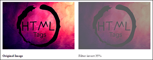
7) CSS3 Filter Invert:
Example:
<!DOCTYPE html>Result:
<html>
<head>
<style type="text/css">
.container{
float:left;
margin:10px;
}
.invert{
filter: invert(35%);
-webkit-filter: invert(35%);
float:left;
margin:10px;
}
</style>
</head>
<body>
<div class="container">
<img src="IMAGE PATH" >
<h4> Original Image </h4>
</div>
<div class="invert">
<img src="IMAGE PATH" >
<h4> Filter invert 35% </h4>
</div>
</body>
</html>
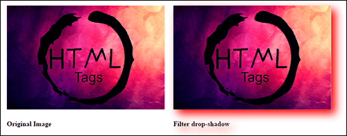
8) CSS3 Filter Drop-Shadow:
Example:
<!DOCTYPE html>Result:
<html>
<head>
<style type="text/css">
.container{
float:left;
margin:10px;
}
.invert{
filter: invert(35%);
-webkit-filter: invert(35%);
float:left;
margin:10px;
}
</style>
</head>
<body>
<div class="container">
<img src="IMAGE PATH" >
<h4> Original Image </h4>
</div>
<div class="invert">
<img src="IMAGE PATH" >
<h4> Filter invert 35% </h4>
</div>
</body>
</html>

Share:


Comments
Waiting for your comments