
How can CSS enhance the HTML visibility
0 6099
HTML (Hypertext Markup Language) and CSS (Cascading Style Sheet) are two of the major fundamentals which are used for designing a website. While the HTML is used for providing the overall structure for the web page, CSS is used for making the web page elements representative.
This can be understood better with the example of our own body structure. For instance, we have skeleton which forms the structure of our body while the muscles and skins make us appear as we are. Similarly, while HTML forms the structure of the webpage, CSS is used for website presentation.
Note that the concept which we will discuss below will also help you crack your HTML interview questions. So, let us dig some more into the topic and find out how a single line of CSS can make the HTML page responsive.
If you are a beginner, you can learn HTML online trouble-free.
Real-Time Application of CSS in HTML:
You must have used the online shopping websites on a daily basis, we all do! So, let's take an example of the Wiximart online shopping webpage. When you open the homepage, you see various icons placed on different locations, including cart, Login, search and several others.
So, where do these icons come from? These icons are embedded into the HTML code using inline HTML elements such as <span> or <i> who are further styled using CSS. Not only icons but other styling elements you see on Wiximart such as box models for items advertisement, scroll bars, items gallery, and the overall web page layout, all these are a result of embedding CSS into HTML page.
So, what exactly is CSS?
CSS, also known as Cascading Style Sheet, is used to provide an appropriate presentation to the webpage including various approaches such as layout, colors, fonts, etc. Moreover, CSS also enables the webpages to be responsive in terms of the different types of devices and respective screen sizes. For instance, when you view Wiximart on windows or Mac, you see the icons on the navigation bar along with their descriptive line. However, while viewing the same page on android or iOS, only the icons are visible to fit into the display. Furthermore, other elements such as items display, gallery, Navigation tab, etc. are also compressed while viewing it in mobile view so that the page is responsive as per the screen size of the device. This is achieved using CSS in the basic HTML coding. So, let us overview further how a single line of CSS can make the HTML page responsive using various examples.
Use Case 1: Responsive Images
We can make the images on the HTML web pages responsive using the CSS. For instance, look at the following piece of code:
This is achieved using CSS in the basic HTML coding. So, let us overview further how a single line of CSS can make the HTML page responsive using various examples.
Use Case 1: Responsive Images
We can make the images on the HTML web pages responsive using the CSS. For instance, look at the following piece of code: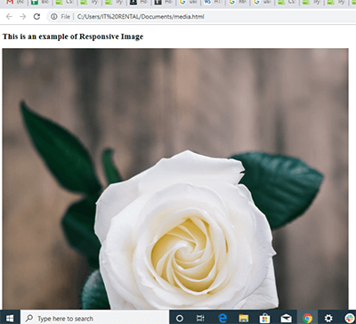 On resizing the window, the image will be displayed as below:
 This will resize the image to fit into the screen size, making the page responsive on different devices.
Example 2: Image Opacity using CSS
Let us assume we want to insert an image as the background of our webpage. So, the basic HTML code we will use is:
This will resize the image to fit into the screen size, making the page responsive on different devices.
Example 2: Image Opacity using CSS
Let us assume we want to insert an image as the background of our webpage. So, the basic HTML code we will use is: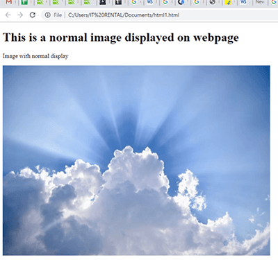 Now, let us add CSS to the code using inline approach to make the image slightly opaque:
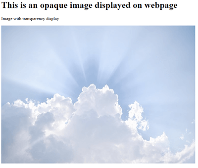
Use Cases 2: Navigation Bars An easy to use navigation bar is one of the most vital elements of a webpage. With the use of CSS, we can change the normal menus of an HTML page into a good looking and responsive navigation bar. For instance look at the HTML code which will be used to include a simple menu on the page: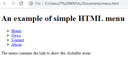 Now, let us make the menu more attractive and responsive using CSS:
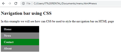 Note that, we have used CSS in this code to design the navigation bar for the page. In the first CSS sheet, the basic styling for all the elements has been done which includes
a) border,
Note that, we have used CSS in this code to design the navigation bar for the page. In the first CSS sheet, the basic styling for all the elements has been done which includes
a) border,
b) color of the text,
c) text style and so on. Further, "li a" is used to style the attributes for the linked elements. We have also created two classes as li.a active and li a:hover:not(.active) which will be used to style the elements which are currently active and which are inactive but hovered on respectively. This implies that the active link (which the user is currently navigating) will be displayed as black color and the link which will be hovered on will be set to green color. To have brief knowledge in terms of CSS styling, you can also search for online courses for HTML and CSS.
Conclusion: a) To sum it all, it is quite evident to say that CSS can be used to greatly enhance and transform the HTML page to be more responsive as well as attractive. b) Now, we can also state HTML as the bone of a webpage, while the CSS being a skin for the same. c) The <meta> tag is used to embed responsive images into the webpage. d) CSS can also be used to develop attractive and responsive navigation bars. These above concepts will also help you crack your HTML interview questions as it serves as one of the most major concept of HTML programming. I hope you found the information on "How can CSS enhance the HTML visibility" easy and interesting.
CSS, also known as Cascading Style Sheet, is used to provide an appropriate presentation to the webpage including various approaches such as layout, colors, fonts, etc. Moreover, CSS also enables the webpages to be responsive in terms of the different types of devices and respective screen sizes. For instance, when you view Wiximart on windows or Mac, you see the icons on the navigation bar along with their descriptive line. However, while viewing the same page on android or iOS, only the icons are visible to fit into the display. Furthermore, other elements such as items display, gallery, Navigation tab, etc. are also compressed while viewing it in mobile view so that the page is responsive as per the screen size of the device.
This is achieved using CSS in the basic HTML coding. So, let us overview further how a single line of CSS can make the HTML page responsive using various examples.
Use Case 1: Responsive Images
We can make the images on the HTML web pages responsive using the CSS. For instance, look at the following piece of code:<!DOCTYPE html> <html> <meta name="viewport" content="width=device-width, initial-scale=1.0"> <!-- meta tag will set the viewport of the webpage to be displayed as --> <body> <h2>This is an example of Responsive Image</h2> <img src="image1.jpg" style="max-width:100%;height:auto;"> <!-- the max-width will ensure that the image is not enlarged more than its original size on resizing the window --> </body> </html>In the above code, the <meta> tag has been used as CSS in the HTML code which will set the viewport of the webpage as the dimension of the page to be used. The width=device-width will set the width scale of the screen and the initial-scale=1.0 will set the initial view of the image to be displayed initially. On running the code, the page will be displayed as follows:
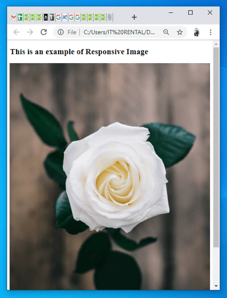
On resizing the window, the image will be displayed as below:
This will resize the image to fit into the screen size, making the page responsive on different devices.
Example 2: Image Opacity using CSS
Let us assume we want to insert an image as the background of our webpage. So, the basic HTML code we will use is:<!DOCTYPE html> <html> <head> </head> <body> <h1>This is a normal image displayed on web page</h1> <!-- the heading to be displayed on page --> <p>Image with normal display</p> <!-- paragraph to be displayed on page --> <img src="clouds.jpg" alt="clouds" width="700" height="500"> <!-- image attribute with name of the image, alt will include the alternate text in case image is not visible and the height and width attribute will set the size of the image to be displayed --> </body> </html>This will display the image on the website as:
Now, let us add CSS to the code using inline approach to make the image slightly opaque:<!DOCTYPE html>
<html>
<head>
<style> <!-- style tag to include the CSS code within HTML -->
img {
opacity: 0.5; <!-- this will set the opacity of the image to 0.5 units -->
filter: alpha(opacity=50); <!-- For version IE8 (internet explorer) and earlier -->
} <!-- This will imply the CSS style on the elements of img tag as the class -->
</style>
</head>
<body>
<h1>This is an opaque image displayed on webpage</h1>
<p>Image with transparency display</p>
<img src="clouds.jpg" alt="clouds" width="700" height="500">
</body>
</html>
In the above code, internal CSS have been embedded into the <head> section inside the <style> element which will be implied on the <img> attribute. With the help of CSS, the opacity of the image has been set to 0.5. This will change the transparency of the original image and the image will appear on the page with 0.5% opacity:
Use Cases 2: Navigation Bars An easy to use navigation bar is one of the most vital elements of a webpage. With the use of CSS, we can change the normal menus of an HTML page into a good looking and responsive navigation bar. For instance look at the HTML code which will be used to include a simple menu on the page:
<!DOCTYPE html>
<html>
<head>
</head>
<body>
<h1> An example of simple HTML menu </h1>
<ul> <!-- listing all the elements of the menu for the page as an unordered list-->
  <li><a href="#home">Home</a></li> <!-- list elements with # to be displayed as a link -->
  <li><a href="#news">News</a></li> <!-- a href will provide the link which will be accessed on clicking the element -->
  <li><a href="#contact">Contact</a></li>
  <li><a href="#about">About</a></li>
</ul>

<p>The menu contains the link to show the clickable areas</p>

</body>
</html>
In the above code, the <ul> and <li> element has been used to prepare a list of menus for the webpage. The <ul> attribute specifies the unordered list and the <li> attribute are used to include the list elements into the list. This will display the menu on the page as given below:
Now, let us make the menu more attractive and responsive using CSS:<!DOCTYPE html>
<html>
<head>
<style>
ul {
<!-- styling attributes for the basic navigation elements will be set -->
list-style-type: none;
margin: 0;
padding: 0;
width: 200px;
background-color: grey;
<!-- the background color for the navigation bar will be set to grey -->
}
li a {
<!-- styling attributes for the linked navigation elements will be set -->
display: block;
color: white;
<!-- this will set the text color of the navigation elements to white -->
padding: 8px 16px;
text-decoration: none;
}
li a.active {
<!-- an active class is created which will set the styling attribute for the active links -->
background-color: black;
<!-- active links will be displayed as black -->
color: white;
<!-- the color for the text will be white -->
}
li a:hover:not(.active) {
<!-- this class will be created for the elements which will be hovered on but are not active -->
background-color: green;
<!-- on hovering, the link will be set to be green -->
color: white;
<!—the color for the text will be white -->
}
</style>
</head>
<body>
<h2>Navigation bar using CSS</h2>
<p>In this example we will see how can CSS be used to style the navigation bar on HTML page</p>
<ul>
<li><a class="active" href="#home">Home</a></li>
<li><a href="#news">News</a></li>
<li><a href="#contact">Contact</a></li>
<li><a href="#about">About</a></li>
</ul>
</body>
</html>
This will display the navigation bar on the page as below:
Note that, we have used CSS in this code to design the navigation bar for the page. In the first CSS sheet, the basic styling for all the elements has been done which includes
a) border,b) color of the text,
c) text style and so on. Further, "li a" is used to style the attributes for the linked elements. We have also created two classes as li.a active and li a:hover:not(.active) which will be used to style the elements which are currently active and which are inactive but hovered on respectively. This implies that the active link (which the user is currently navigating) will be displayed as black color and the link which will be hovered on will be set to green color. To have brief knowledge in terms of CSS styling, you can also search for online courses for HTML and CSS.
Conclusion: a) To sum it all, it is quite evident to say that CSS can be used to greatly enhance and transform the HTML page to be more responsive as well as attractive. b) Now, we can also state HTML as the bone of a webpage, while the CSS being a skin for the same. c) The <meta> tag is used to embed responsive images into the webpage. d) CSS can also be used to develop attractive and responsive navigation bars. These above concepts will also help you crack your HTML interview questions as it serves as one of the most major concept of HTML programming. I hope you found the information on "How can CSS enhance the HTML visibility" easy and interesting.

Share:


Comments
Waiting for your comments