Multi-Device Design
0 620
📱✨ Understanding Multi-Device Design
Multi-Device Design is no longer a luxury—it's the backbone of modern digital ecosystems. Users switch between phones, laptops, XR headsets, tablets, and even wearables within seconds. Ensuring a consistent and meaningful experience across all these platforms is what Multi-Device Design is all about. In this blog, let’s break down how developers and designers can craft fluid cross-device experiences that feel natural and intuitive.🖥ï¸ðŸ“² Why Multi-Device Experiences Matter
Today’s user journey often spans multiple devices. You may start reading an article on a mobile phone, move to a laptop for deeper work, and later check quick updates on a smartwatch. Consistency, continuity, and adaptability form the core of Multi-Device Design. When experiences seamlessly adapt, users stay more engaged and feel a stronger connection with the product.🔗🌠Key Pillars of Multi-Device Design
Multi-device design thrives on three core principles:- Continuity: Users should be able to resume tasks effortlessly across devices.
- Responsiveness: UI layouts must adapt naturally to varying screen sizes and interaction models.
- Context Awareness: Each device has strengths—design should leverage them mindfully.
🧩📠Designing Adaptive Layouts
UI that adapts gracefully is key in multi-device workflows. Designers rely on fluid grids, scalable typography, flexible components, and interaction patterns tailored for touch, pointer, controller, or gesture input.
// Example: Simple CSS Layout for Multi-Device Responsiveness

.container {
    display: grid;
    grid-template-columns: 1fr;
    gap: 16px;
}

@media (min-width: 768px) {
    .container {
        grid-template-columns: 1fr 1fr;
    }
}

@media (min-width: 1200px) {
    .container {
        grid-template-columns: 1fr 1fr 1fr;
    }
}
ðŸŽ®ðŸ•¶ï¸ Multi-Device Design for XR
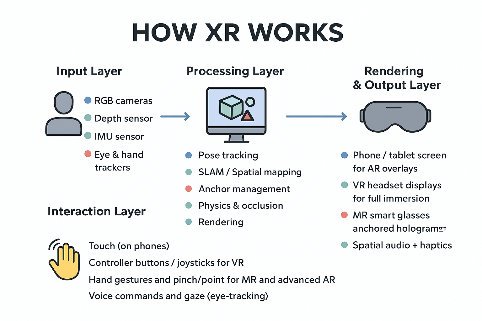
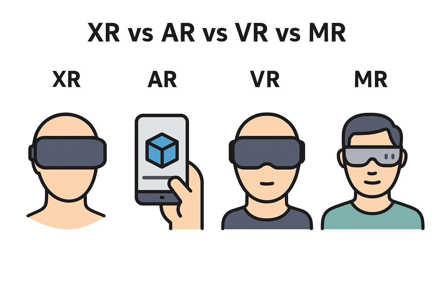
With XR becoming more mainstream, multi-device interactions are shifting into spatial environments. Designing for VR, AR, and MR requires attention to depth, gesture inputs, gaze interactions, and field-of-view variations.
// Unity: Switching Interaction Profiles Based on Device

void ApplyInputProfile(string deviceType) {
    if (deviceType == "VR") {
        ActivateVRControls();
    } else if (deviceType == "AR") {
        ActivateARGestures();
    } else {
        ActivateStandardTouchControls();
    }
}
📡🔄 Syncing User Data Across Devices
Smooth device transitions depend on real-time data sync. Cloud-based systems allow session states, progress, preferences, and history to follow the user across screens.
// Example: Saving User Progress to Cloud (Pseudo-code)

saveProgress(userId, progressData) {
    cloudDB.update(userId, {
        "progress": progressData,
        "timestamp": Date.now()
    });
}
🧪📊 Testing Across Devices
A product might work perfectly on one device but fail on another. Multi-device testing ensures consistent performance, accessibility, and usability across:- Mobile phones (Android / iOS)
- Desktop environments
- XR headsets
- Smart TVs
- Wearables
💡🎯 Final Thoughts
Multi-Device Design is the future of digital interaction. As our devices become more interconnected, experiences must evolve to be adaptive, responsive, and seamless. Whether designing for a smartwatch or an XR headset, the goal remains the same—build cohesive journeys that respect device strengths and user expectations. When done right, Multi-Device Design bridges the gap between hardware and human experience beautifully.If you’re passionate about building a successful blogging website, check out this helpful guide at Coding Tag – How to Start a Successful Blog. It offers practical steps and expert tips to kickstart your blogging journey!
For dedicated UPSC exam preparation, we highly recommend visiting www.iasmania.com. It offers well-structured resources, current affairs, and subject-wise notes tailored specifically for aspirants. Start your journey today!

Share:


Comments
Waiting for your comments